Making the largest online encyclopedia accesible
I redesigned key parts of a financial dashboard to improve transaction visibility, simplify navigation, and help users understand their finances faster during everyday workflows.
Context
Wikipedia's mission is free knowledge for everyone. This project was them following through on that promise.
Wikipedia serves 508 million readers a day across 342 languages. More than half of them are on mobile. When iOS 26 shipped Liquid Glass and redesigned the interface, Wikipedia wanted to make sure the app still worked for every single one of them.
That's where we came in.
Problem Statement
How might we ensure Wikipedia's iOS app remains accessible to all users following the iOS 26 update?
Our Goals
What we wanted to achieve by the end of this project
Impact of IOS 26
Understand how Liquid Glass changes the accessibility of Wikipedia's core reading and search experience
Find barriers
Identify what's creating difficulties for users with visual, motor, cognitive, or situational disabilities while using the app
Actionable Insights
Recommendations: ranked by impact, reasoned, and rooted in access barriers uncovered throughout the audit
Prioritizing the scope
Two core flows: Search and Reading

Search
Accessing and opening search
Conducting a search and interpreting results
Navigating to their desired destination

Reading
Overall reading experience of an article
Access to features: text settings, colors etc
Visibility and usability of in-article elements
The Methodology
Building our study plan
Persona Development
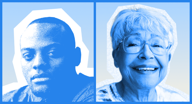
Built two personas spanning four disability profiles:
(1) low vision & situational (one-handed use)
(2) essential tremor & Asperger's
Cognitive Walkthrough
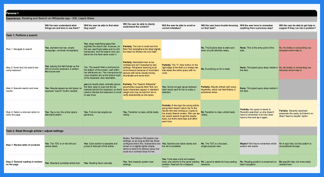
Stepped through each flow from the perspective of our personas — surfacing friction points that standards-based testing alone wouldn't catch.
WCAG 2.1/2.2 Audit
WCAG 2.1/2.2 Audit*
Audited flows against WCAG guidelines 2.1/2.2.
Developing personas
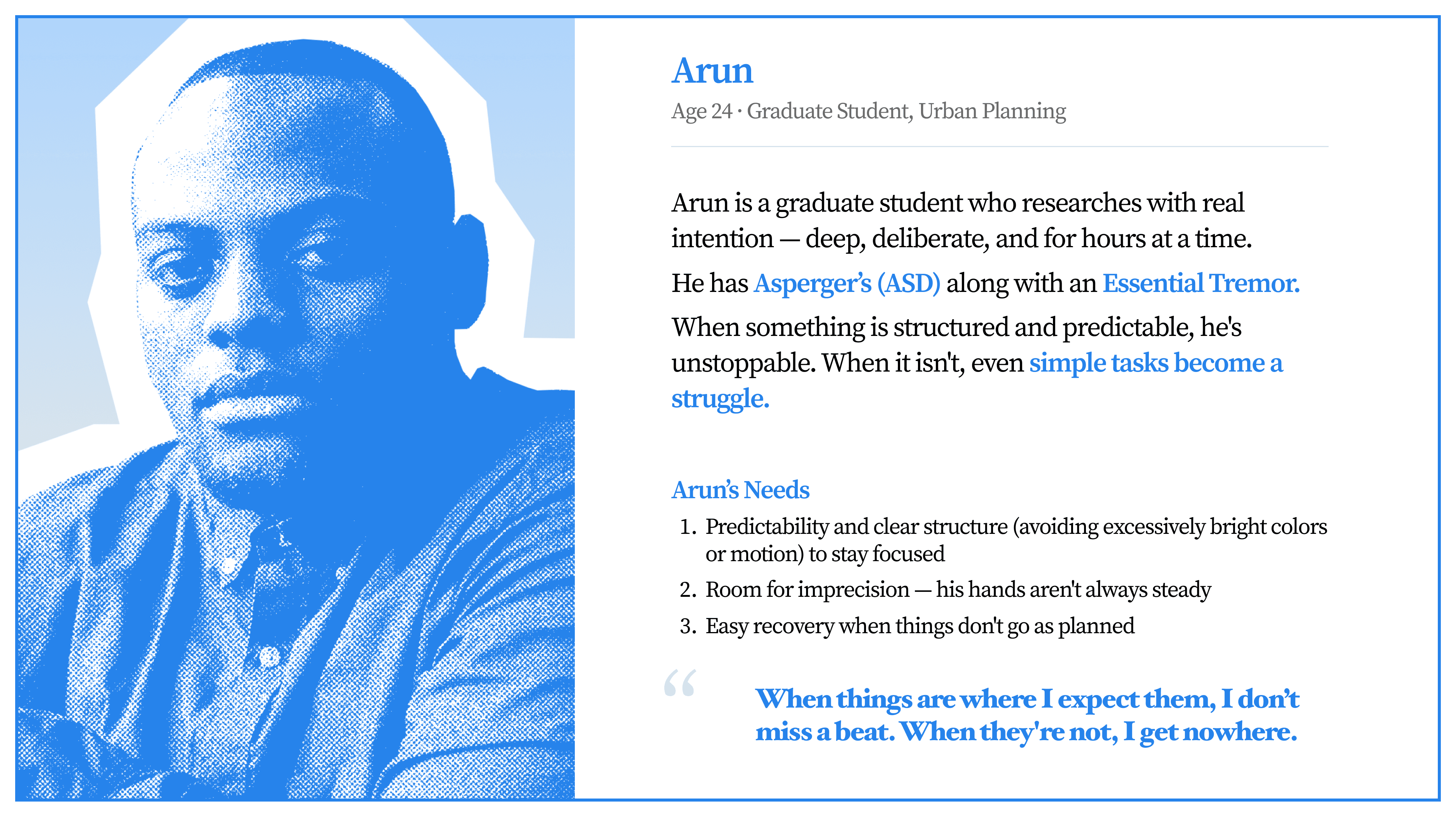
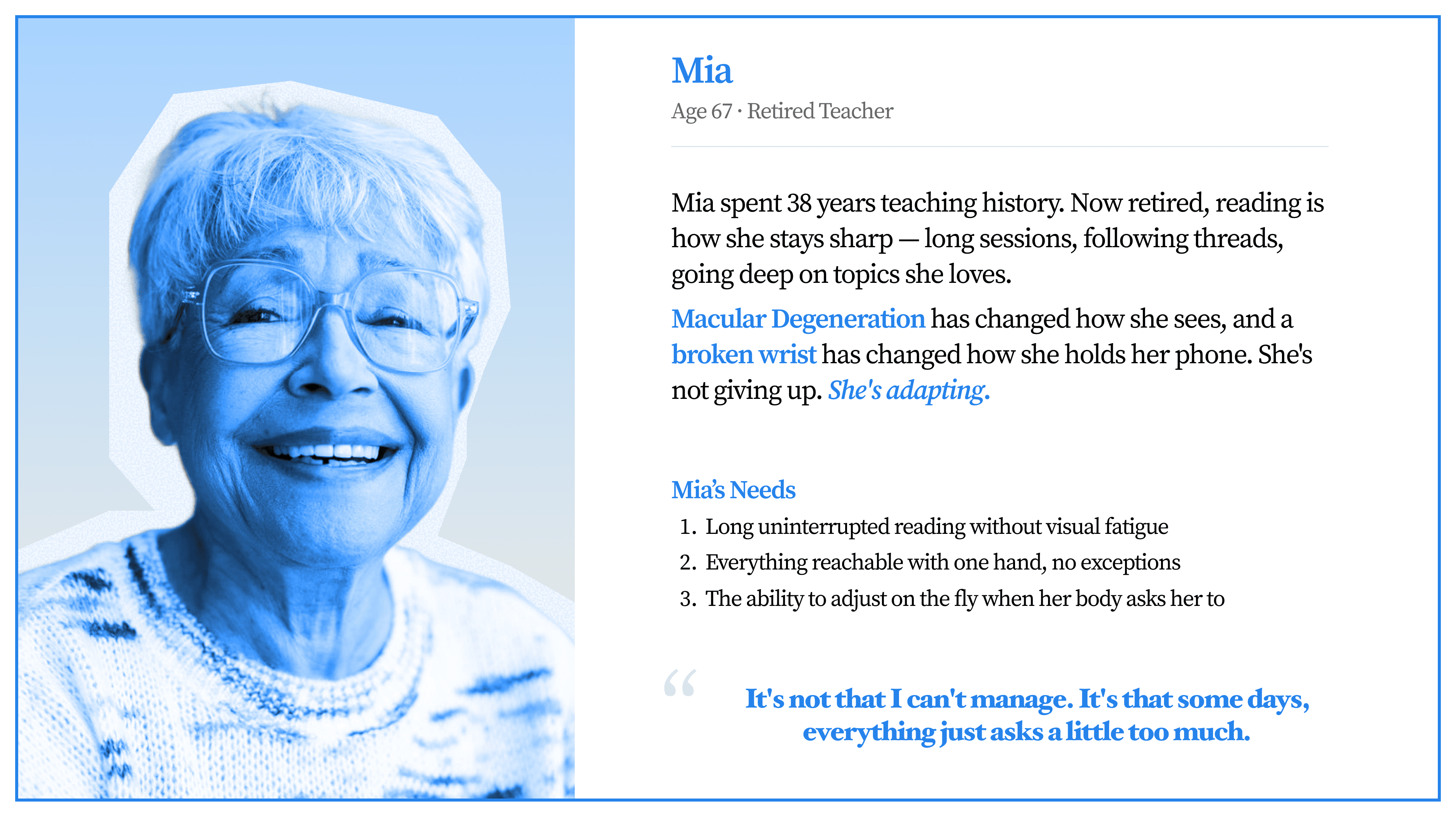
Arjun and Mia: Meet the people we're designing for
Wikipedia is a nonprofit running on limited resources, so when it came to our personas, we didn't have the opportunity to test with real participants. We made the most of what we had by incorporating specialist conversations, academic research, lived experience resources.
We built Mia and Arun to be as real as we could make them — two personas, four disability profiles, four lenses on every finding.


Cognitive Walkthrough
Stepping into someone else's experience
Stepping through both flows as Mia and Arun, task by task, we looked for every moment where the interface asked too much — where confusion crept in, where an interaction didn't recover, where something that should have been simple wasn't.
Each step was color coded — green for no issue, yellow for partially problematic, red for a failure. That gave us a clear picture of where the experience broke down and for whom.

WCAG Audit
Testing it against WCAG standards
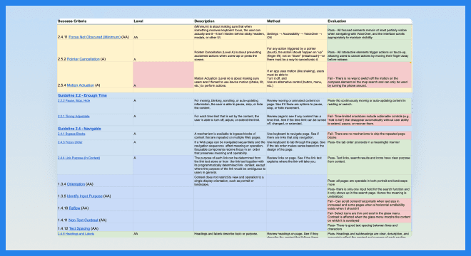
We tested both flows against WCAG 2.1 and 2.2 up to Level AA — criterion by criterion, pass or fail. No subjectivity, no interpretation. Just whether the app met the guideline or it didn't.


Our Findings, ranked by Impact
We structured our findings by how severely they impacted access — Tier I being critical issues that needed to be addressed immediately, Tier II significant barriers, Tier III longer-term enhancements. Here we walk through the five Tier I findings in depth.
Tier 1 - Critical
Hyperlinks lack non-color differentiation
WCAG 2.1 SC 1.4.1 - Use of Color
collapse

Tier 1 - Critical
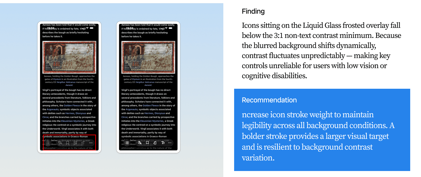
Icon stroke insufficient under frosted glass - and doesn't respond to Dynamic Type
WCAG 2.1 SC 1.4.11 — Non-text Contrast
collapse
Tier 1 - Critical
Save confirmation auto-dismisses - and the feature itself is conceptually unclear
WCAG 2.1 SC 2.2.1 — Timing Adjustable & Lack of Affordance
collapse

Tier 1 - Critical
Key elements excluded from VoiceOver
WCAG 4.1.3 — Status Messages; WCAG 4.1.2 — Name, Role, Value
collapse


our takeaway
Closing Reflections
This project came with some real constraints — no participants, limited resources, a four week window. This made it equally daunting and exhilertating.
We found ways to work through all of it. Putting ourselves in Mia and Arun's shoes, even imperfectly, made us better researchers. Working alongside a team that brought that same care to every finding made it something we're genuinely proud of.
Thank you to Carolyn and the team at Wikipedia for the opportunity and for being so wonderful to work with. And to Liza, for the guidance and for introducing us to this world.
Accessibility work matters. We're glad we got to do some of it.