
a quick rundown
The tl;dr
Problem:
There's only one model for screen-time intervention: restrict, block, guilt. It hasn't worked. 74% of people who try to reduce their screen time fail.
What I did:
Three phases of independent research — app testing, 1:1 interviews, prototype validation — across 17 participants to understand why.
What we found:
The tools aren't failing because people aren't trying. They're failing because they're built on the wrong premise.
What we built:
A framework for a new model — and an app to prove it works. Complete tasks, earn access, let AI handle the rest. (jump to design)
Role
Independent Researcher + Product Designer
Team
Solo research · Team of 2 for design
Timeline
6 months
Tools
Figma · Zoom · UserTesting
Let's start with the basics
We've been asking all the wrong questions
Over the past couple of years, a quiet movement of going analog has been gaining traction. There's YouTube tutorials on turning smartphones into dumb phones. People switching back to analog planners. A growing desire to reclaim attention. And yet most attempts at digital detox fail without structural support.
The desire to disconnect is real. The tools to do it effectively are not.
76%
feel like they spend too much time on their phones everyday
73%
believe their phones negatively impact their mental health
83%
Gen Z have an unhealthy relationship with their phone
(BePresent 2024)
We know the awareness is there, the willingness to change is there and it's been there for a while. But all this time we've been asking why people want to be online so bad. The real question is:
Why are we struggling to be offline?
It's not you, it's them
Here's why we struggle to get off our phones
Every feature you find hard to resist was designed that way. Social media platforms use the same behavioral mechanics as slot machines — not by accident, but by design.
Variable ratio reinforcement means the next scroll could be nothing or everything. Pull-to-refresh mimics a jackpot. Infinite scroll removes the moment you'd naturally stop. These aren't features. They're retention tactics built by teams whose only metric is how long you stay.

Let's go back to the beginning
if this many people are struggling, and tools exist to help them, why isn't it working?
Three phases of research, 17 participants, and an iterative design process set out to find where the disconnect was and what people actually needed.

5 participants completed a diary study testing three apps in the market over a week, submitting logs every night. Each addressed either delay, mindfulness, and harsh blocking techniques. At the end of the week, a focus group explored one question: how could tools like these better support people who want a break from their phone but can't seem to get one.
"I needed Instagram for work and couldn't get on.
It kept blocking me and asking me to do push ups."
V,25
"I got used to just tapping through it. It didn't really make me stop thinking anymore."
K,22
"The forced breathing exercises are starting to feel like cruel and unusual punishment."
C,26
Lack of
personalization

Absence of a sustainable middle ground

Shallow
reward systems

Phase 1 showed me what was broken about the tools. Phase 2 was about understanding the people using them. I ran a survey alongside 8 in-depth interviews with users who self-identified as having a problematic relationship with their phones — people who had already tried to change and failed.
I clustered observations into themes through an Affinity Map — looking for the moments, motivations, and friction points that kept repeating.

Rather than pointing to a single issue, the research revealed the obvious, that screen use is deeply embedded in daily routines. Phones are used to connect, unwind, procrastinate, and cope with moments of mental fatigue. Any solution would need to adapt to these realities rather than attempt to override them.
As we explored users’ screen-time habits and their experiences with existing tools, we uncovered distinct ways people think about and manage their screen time, shaped largely by their everyday routines.
“It’s something that I’ve been fighting for years at this point, and I think the issue is that it’s in my hands… no one wants to be on their phone for 8+ hours a day.”
Darla, 27
To better understand how screen time accumulates, I made a user story and then mapped a typical user journey around everyday phone use. Rather than focusing on edge cases, we looked closely at familiar moments where intention slowly gives way to habit.
User Story

Ideation
What kind of solution would work?
Phase 1 ended with a hypothesis: users wouldn't change through restriction — they'd change through incentive. A full behavioral shift, not a behavioral block. The next two phases tested whether that held up. They did. Restriction alone was failing users. Paired with positive reinforcement, it had a chance of working.
The question wasn't whether to build a reward-based system anymore. It was what one should actually look like.
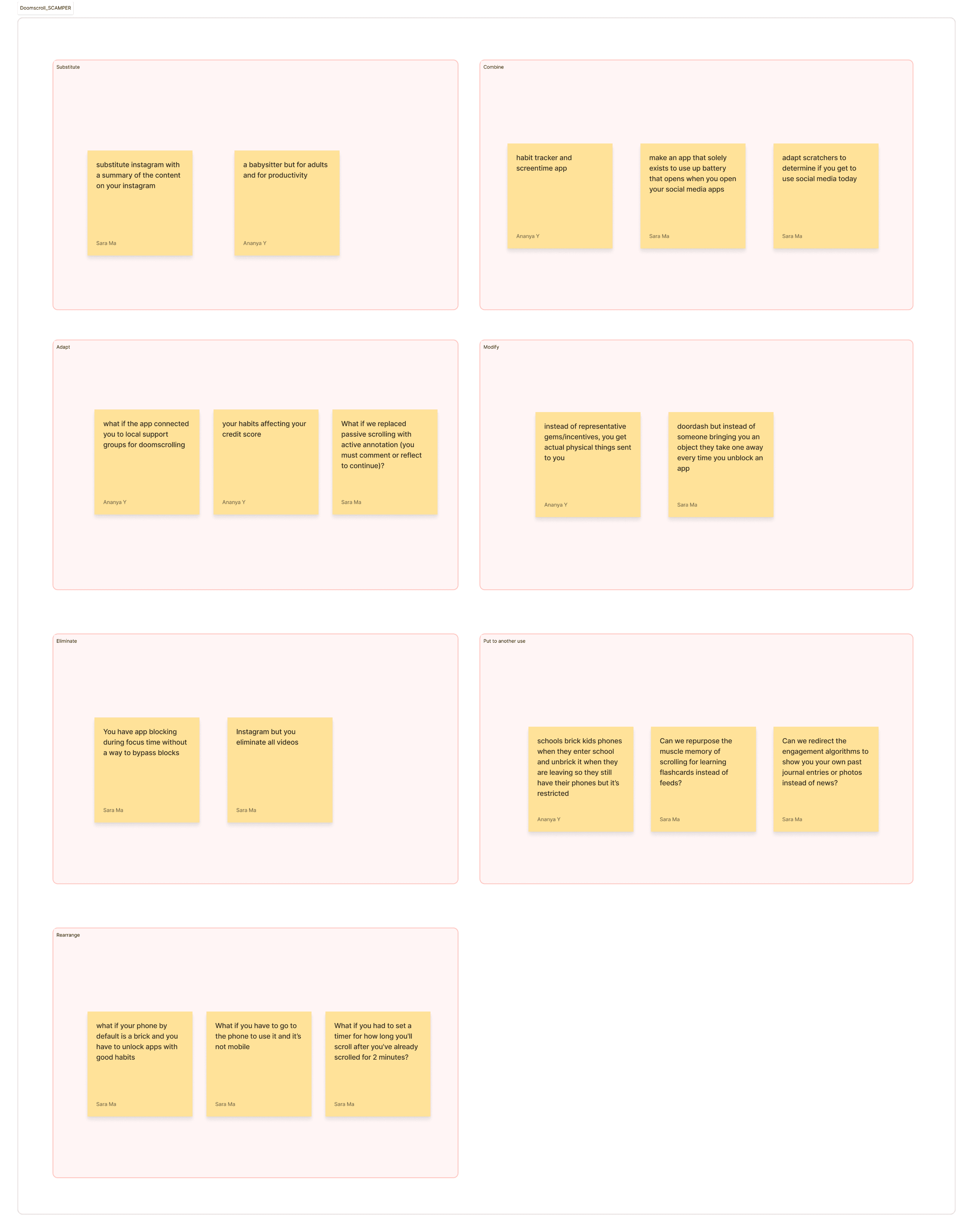
I used a mind map to chart how the core concepts connected, MoSCoW to commit to scope, and SCAMPER to pressure-test that commitment.


The hypothesis held up across the research. Ideation made sure it could hold up as a product.
building a new model
So, What if access was something you earned?
At this point we've learned most of the existing tools were built on a similar premise: restrict the user to protect them from themselves.
The research kept pointing to a different premise which we later mapped out with our ideation. We had 3 main goals:
lower cognitive load

adapt and be flexible
Reward
don't restrict
To achieve these three goals, we asked ourselves: What if the tool worked with the user instead of against them? What if the apps you'd been avoiding became the reward for the tasks you'd been avoiding?
What if the dynamic flips and somehow restriction becomes motivation?


The existing model traps users in a frustration loop. The proposed model turns the same loop into a feedback system.
Design Ideation
From model to mechanics
The model gave me the what. The flows gave me the how. I started by mapping the two loops that mattered most — earning points and spending them — then sketched against those flows to find the form.


We tested the Mid Fidelity prototypes with 5 user, similar to the demographic I had tested in the initial phases.
The goal wasn't to confirm the design worked. It was to find where it didn't.
Two patterns emerged. Each one became an iteration.
The problem:
Users felt stuck in the conversational onboarding. They couldn't tell what the product did before being asked what they wanted from it.
The fix:
Restructured onboarding to lead with the system, then personalize. Show how it works first. Ask what they want second..
"I’d rather see the task system visually, outside of the chat."
- User K

BEFORE
AFTER
Feature overview first.
Personalization through chat second.
Clearer. Friendlier. Faster.
The problem:
The original Bummer Screen showed users their points but not their pending tasks. Out of sight, out of mind — users hit the block, didn't know what to do next, and lost momentum.
The fix:
Redesigned the screen to surface pending tasks alongside the points balance. The block becomes a redirect — instead of "you're locked out," it's "here's what unlocks it."
"Can It tell me what task I can do?
Right now, it feels like a dead end."
- User R

BEFORE

AFTER
A gentle stop.
Redirect to a quick task.
Back to your apps in no time.
The first fix made the system legible. The second made it coherent.
Neither changed the model but both changed how the users experienced it.
Introducing

a sneak peak
The Concept
NOMO explores a simple shift: screen time isn’t taken away — it’s earned through meaningful, offline action.
By tying digital access to intentional tasks, the system reframes screen-time management as habit-building rather than restriction. This concept became the basis for exploring a more motivating, flexible, and supportive approach to behavior change.
Turn your screen time into something you earn, not something you lose.
Set up your to do list with tasks.
Complete tasks to earn points,
which unlock screen time for the apps you chose.
Tasks are weighted by priority
High priority → more points
(deep-focus or effort-based)
Medium priority → moderate points
Low priority → small, quick wins
Set daily app time limits
Once you hit your daily limit, distracting apps stay locked — but you can always earn time back by completing meaningful tasks.


IOS Widgets
A framework for digital wellness
The goal isn't less screen time. It's a better life.
NOMO isn't a solution. It's a hypothesis that was tested.
The hypothesis was that reward-based interventions could outperform restriction-based ones — that users would change through incentive, not friction. The research and the prototype tested that idea. The result was promising enough to suggest the premise is worth taking seriously.
But the bigger question isn't whether NOMO works. It's whether the field is asking the right questions in the first place. 74% of people who try to reduce their screen time fail. That number doesn't reflect a lack of willpower. It reflects a field designing on the wrong premise.
This framework is what came out of asking better questions. It's not a prescription. It's a starting point for anyone designing digital wellness tools — or any digital service that asks people to change their behavior for their own good.
